
A navigation app for finding the highest-quality fuel for your high-performance vehicle
Brian Ferry | June 2023
UI Case Study
My roles:
Competitive Analysis Wireframing UI Design
User Flows User Testing Prototyping
Tools:

iOS
Android
About High Test
When your vehicle is your pride and joy, and especially when it’s tuned to perform beyond factory specifications, high quality fuel is essential to keeping it running at its best. High Test provides a resource for car enthusiasts to find gas stations with high quality fuel whether it’s Top Tier gasoline or E85 ethanol. Results of ethanol tests can be shared to give other enthusiasts peace of mind when it comes to filling up.
Inspiration
Gasoline has Top Tier standards but no such industry standard exists for ethanol. Not only that, ethanol content in E85 fuel can vary from 50-85% and still be sold as E85, which can have a dramatic effect on engines that are pushing the performance limits. Enthusiasts need to test E85 fuel at the pump to ensure they are receiving the correct fuel required by their engine tune. Apps to find gas stations and their pricing exist, but few cater to the performance enthusiast, and none include native navigation.
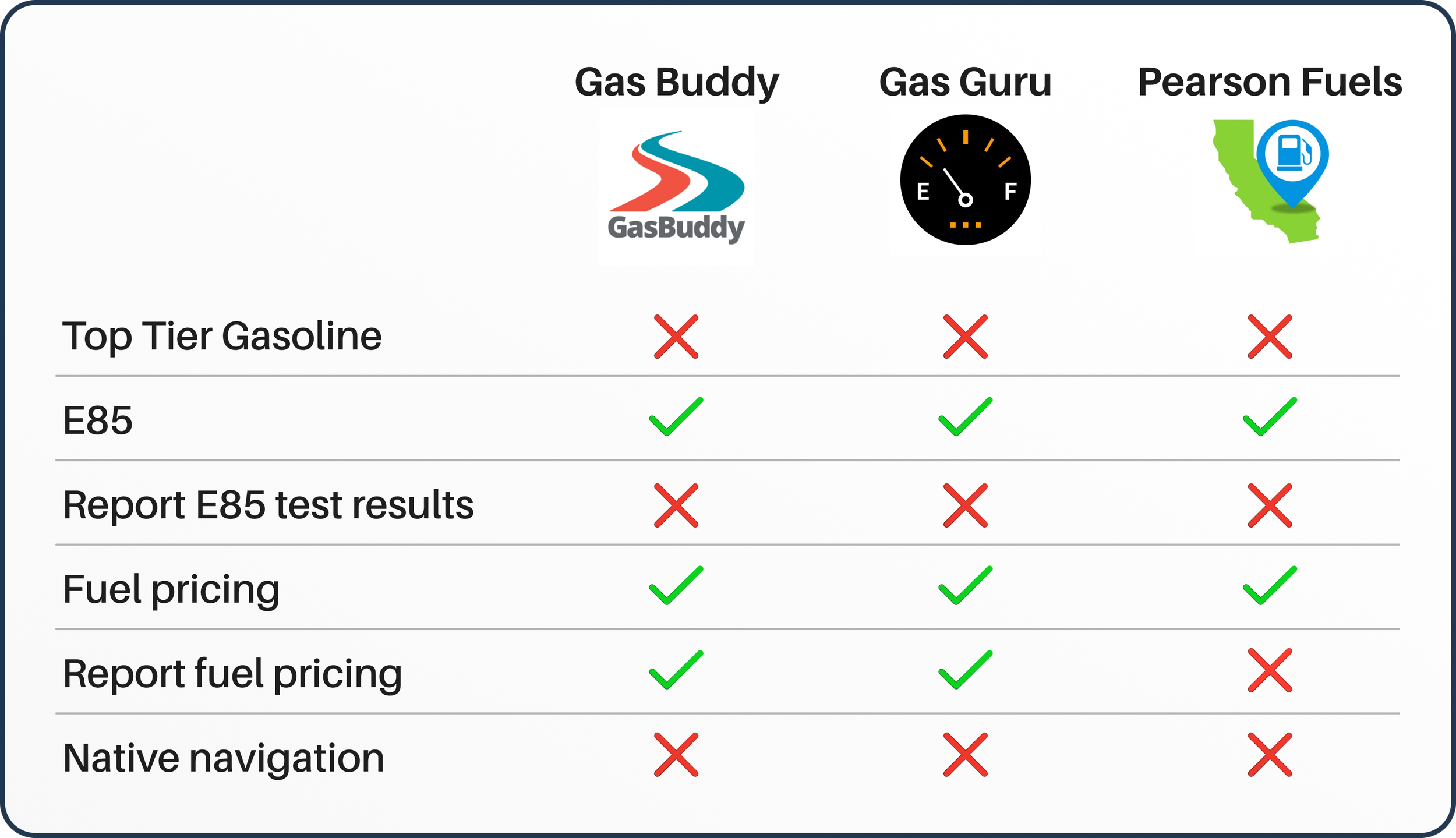
Competitive Research
I analyzed three competitors, including one which was focused on E85, Pearson Fuels. What I found was they all achieved their goal of helping users find fuel at a decent price, but they fell short for the customer that needs more from the fuel of their choice. Searching for Top Tier gasoline was not an option from any of them, nor was there anything to indicate the ethanol content of the E85. Navigation was not a feature with any of the competitors, either.
User Flow
Including navigation makes it easier for the user by only needing to open one app, and also increases the likelihood of users reporting the results of their E85 tests with the option to visit the gas station’s page upon arriving at their destination.

Low and Mid Fidelity Wireframes
I wanted to challenge myself by tailoring the app to its respective platforms so it would feel instantly familiar to the user. Navigating the app is completely different between iOS and Android, iOS is more gesture-based , while Android relies more on buttons and a tab bar. One of my other concerns was keeping the gas stations’ ethanol average prominent without alienating gasoline-only users.

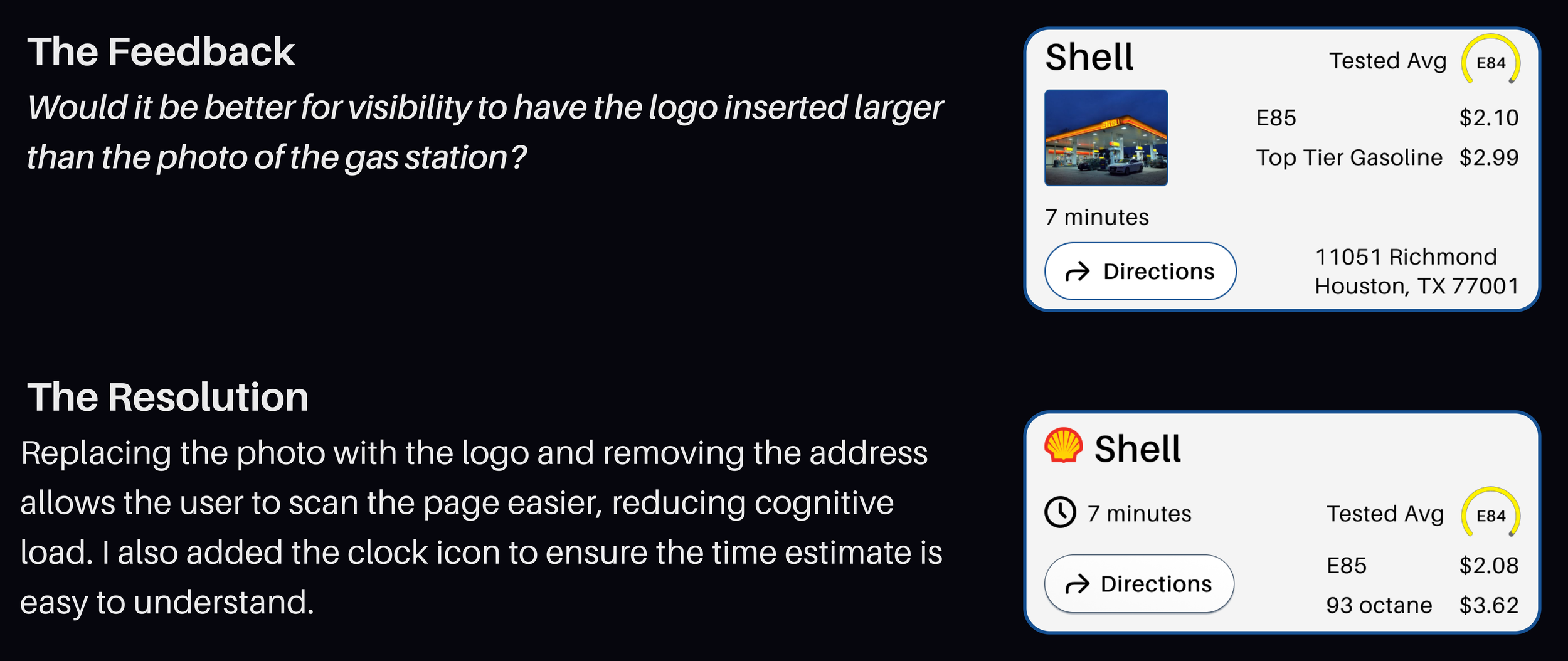
User Testing


Icons and Elements

Color Palette


Fonts
Final Screens and Mockups


Next Steps
I’d like to add features to the profile page such as a garage for multiple cars under one profile and an easy way to switch between them, as well as a dark mode version like this test version. I would also like to conduct more user testing to determine how many users utilize the “Go to store page” upon arriving at their destination to input their data and how that function could be improved upon.
