My Roles:
UI Design
Storyboards
Animation
Tools:
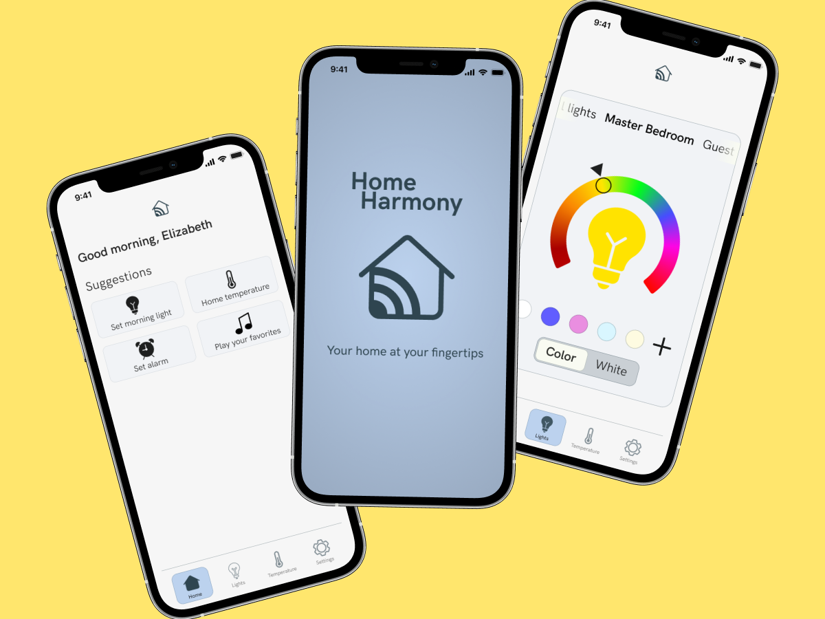
Home Harmony
Your home at your fingertips
About Home Harmony
Home Harmony is a smart home app for the modern household. I was tasked with defining the brand guidelines, developing high-fidelity screens, as well as designing all storyboards and animations. When conducting market research, I noticed that most of the other apps featured intuitive and approachable design. The animations in the apps were simple so as not to overwhelm the user. I chose soft, inviting, and secure as the core values of the app to ensure it would feel instantly comfortable and familiar to anyone who used the app.

Storyboards and Final Screens
After some iteration, I landed on the quick flip transition between screens. While I wanted the app to feel soft and inviting, I also wanted the animations and transitions to feel quick and responsive to give the user a real sense of control of the app and their home. To help keep it familiar and approachable, I knew I needed clear iconography and a focused, uncluttered interface with ample white space so that the key elements of the app were easy to find.


Thank you for reading!

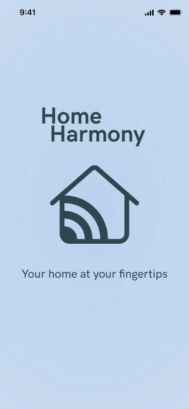


Preloader Animation
It was important that the preloader set the tone, so it needed to be crisp and precise to convey the sense of control the user will have over their home. The Wi-Fi signal filling the house reinforces the brand by showing the user that they can have control throughout their home. After drafting a storyboard to organize my thoughts, I built the below animation.